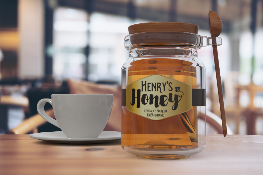
Henry's Honey: Logo Design
Design Brief:
Create a logo and label for a fictional company. This was a project I did for fun to expand my portfolio and keep my design skills fresh. As I currently work as an in-house designer, I try to do little projects like this to step out of my graphic design bubble. This was also a good excuse to begin learning the fundamentals of Adobe Dimension.
Thought Process:
I knew I really wanted to play with typography for this project. The font choice was something that I put a lot of thought into. For the bulk of the text I used Murmers Regular. Its old fashioned appearance creates a sense of longevity and trust. For Honey I used Sortdecai Brush Script. I love how it feels syrupy and emphasizes what honey is. It's playful nature is a perfect way to maintain balance with the more serious base type. My little bee is not only a cute addition (and another way to visually say "honey")- it also serves the purpose of being the counterweight to the "H" in Honey.